Where Bitcoin stands this week: an uptrend on both degrees
También disponible en español →
Every Tuesday this piece reads Bitcoin's structure the way the app's market moment alerts do: a higher degree on weekly candles, a lower one on dailies. This week the read is an uptrend on both degrees, with the weekly structure pointing up and the daily one up. Everything here looks one week to one month out, no further.
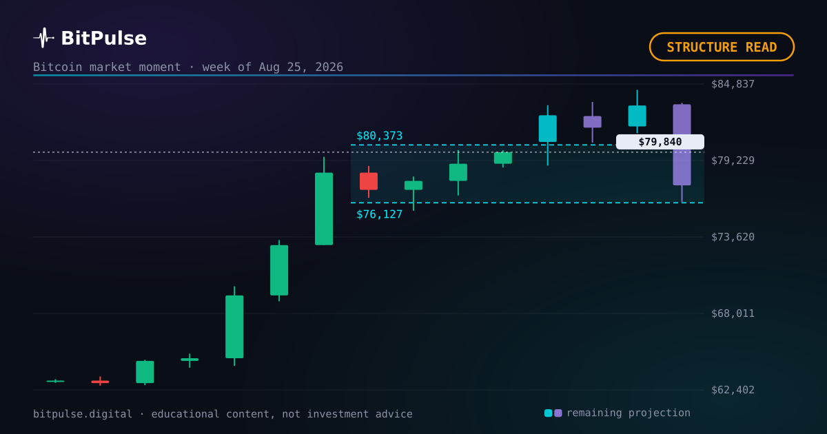
What the structure says this week
The read here uses two degrees of structure, the same ones behind the market moment alerts in the app. The higher degree runs on weekly candles and it is pointing up: its last confirmed pivot was 8 weeks ago and price has moved +38.1% since. The lower degree runs on daily candles and points up, 11 days after its own turn.
Both degrees agree right now, and that is the cleanest kind of read this indicator produces: the weekly trend and the daily moves are telling the same story.
What the model pencils in for this week
Zoom out for a second. For the next seven days the projection line sits around $82,869, with the pessimistic-to-optimistic scenarios spanning $71,585 to $93,450. Those are the same numbers drawn on the live chart, recalculated daily, so they will drift as the week plays out.
Context for the week: realized volatility sits at the 39th percentile of its history, and the market risk index reads 16 out of 100. Neither quiet nor stormy: a middling tape.
One month out, and no further
Stretching to thirty days, the projection line sits around $80,937 and the scenarios open up to $58,891 to $130,539. The band widens with time on purpose: a month of Bitcoin carries real uncertainty and pretending otherwise is how forecasts embarrass their authors.
This piece deliberately stops at one month. Beyond that, structure reads decay into noise and the useful tools change: cycle position, halving distance, the long projection. Those live on the site, recalculated daily.
The track record this range joins
Set the price aside for a moment. 6 of the 7 projected weekly ranges published so far resolved inside the band. Every one of them was frozen before its week, and every result went up afterwards, including the ones that went wrong.
There is a trap in that number worth naming. A band that contains the close every single time is not a good model, it is a wide one. The published band is the middle half of the distribution, so a properly calibrated engine should land inside about half the time. A hit rate far above that means the bands are wider than they should be, which is a miscalibration too, just the flattering kind.
The Bitcoin model behind the range
The band is not one forecast dressed up as a range. It comes out of a combined engine of four models (a power law over a decade of price history, a Monte Carlo simulation driven by GARCH volatility, an Ornstein-Uhlenbeck residual model and an implied density read from the Deribit options surface), pooled and reweighted every week against real history. Each one is wrong in its own way, which is the point: pooling them cancels part of the error that any single Bitcoin model carries alone.
Around fourteen live data sources feed the bias layer on top, among them MVRV-Z, SOPR, NUPL, the Puell multiple, Reserve Risk, the Bitcoin realized price, funding rates and global liquidity. What comes out is a distribution of thousands of simulated price paths, and the published band is its middle half, from the 25th to the 75th percentile. Roughly one path in two ends inside it.
The cycle clock, for context
Context first, verdict after. For the longer frame: this is day 858 since the April 2024 halving, and the next halving is estimated by block height around February 6, 2028. Cycle position does not decide what next week does, but it sets the base rates: the same daily candle reads differently at day 200 than at day 858.
Words like accumulation and capitulation belong to this clock, not to any single week. They are called with hindsight, from structure and time together, which is why this piece reports the structure and lets the labels wait.
What happens next
Now the part most readers skip. The next projected range is drawn over the live Bitcoin chart in the app, alongside the dated zones for the longer horizons, and it is recalculated on the server every day so that every visitor sees the same numbers. Nothing here is computed in your browser and nothing is personalised.
None of this is investment advice. It is one statistical model keeping its numbers where anybody can check them, including the weeks it gets wrong.
What is on the calendar
- US GDP (preliminary)
The projection does NOT use this data. We measured it: a macro release moves Bitcoin by one or two points over ten days, while Bitcoin’s own swing over that same window is close to thirteen. It drowns, so adding it would decorate the model rather than improve it. This is here as context.
Frequently asked questions
What is the Bitcoin market moment?
A read of where price sits in the movie: an up or down phase, a correction inside a larger trend, a directionless market, a fresh reversal or an extreme of the projection cone. It comes from two degrees of structure, one on weekly candles and one on dailies, the same engine behind the market moment alerts in the app. This week the read is an uptrend on both degrees.
Is this a Bitcoin price prediction?
No. It is a projected price range: the central band of thousands of simulated scenarios, published before the fact and checked after. Here it covered $NaN to $NaN. It is educational content and it can fail; it is not investment advice.
Where can I see the full track record?
On the results page, with every checked projection, hits and misses alike. This piece's range, $NaN to $NaN, ends up there too.
Published before the fact
Bitcoin dominance: – · Altseason: –
The 7, 30 and 90-day zones are checked on the free account; from six months to three years belongs to Pro. See the plans →